
Role
Sole designer
UX Research, Visual Design, Interaction Design
Timeline
August - September 2025
Team
1 Product Manager
1 Engineer
🛠️ This case study is still under construction
Problem
Despite having a rich set of features for online teaching. Pencil Spaces struggles with low adoption rate
Pencil Spaces is an all-in-one platform for teaching that brings together a whiteboard, video calling, and built-in educational tools. The goal was to eliminate the need to juggle multiple tools like video calling and screen sharing across tabs by creating one unified workspace. However, the platform still faced challenges in converting users who were accustomed to traditional video-calling experiences like Zoom or Google Meet.
Solution
Simplifying the tools and apps inside a Space
Context
What are some of the project constraints?
Working around short project timelines
Designing multiple features, branding, and marketing assets required
Working with a web-app based platform
Research and Discovery
Current State
Taking a look at our existing survey from our customers, we noticed that there were a lot of frustrations around discovering and learning how to use the platform. Many were impressed by the features we offer, but users were frustrated that they didn’t really know where to start.

50% of the participants were satisfied with the current Pencil Spaces experience
10% of the users liked using our features compared to using traditional video-conferencing tools like Zoom

100% of the users didn’t understand fully understand what the platform was
Users had trouble navigating the different features that we offered
Takeaways
Key Findings
1/ Basic features are hard to find and navigate
2/ Younger students struggle with overwhelming controls
3/ No proper onboarding leads to steep learning curve
Design Prompt
Final Design
Improved Organization and Information Architecture
Bottom tool bar
Research showed that users struggled to find key features due to cluttered tool organization. For example, screen sharing was grouped together with whiteboarding tools, even though they served different purposes. Overcrowded icons, labels, and buttons created confusion and increased cognitive load.
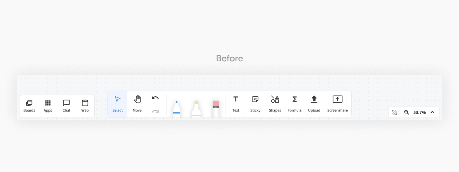
In the redesign, we structured the interface around user workflows. The left sidebar now focuses on collaboration entry points like Chat and Boards, while Web and Apps—which appear directly on the board—were moved to the middle toolbar alongside other whiteboarding tools. The right side is dedicated to contextual video-conferencing controls that only appear during calls.

Video Calling Features
User research revealed significant discoverability and organization issues within the video-calling experience. Key settings—such as audio, video, screen sharing, and virtual backgrounds—were inconsistently placed or buried within a large dropdown. The lack of grouping made it difficult for users to scan and locate the right tools efficiently during sessions.

The redesigned video call controls were simplified into three main buttons. Audio and video settings now appear on hover within their respective buttons, while the overflow menu presents a clear, organized list of additional options

Final Design
Tailoring the Experience to Every Device
Around 30% of Pencil Spaces users accessed the platform via tablet or mobile. However, the platform was originally designed with a desktop-first approach. As a result, the responsive design relied primarily on hiding features on smaller screens rather than being thoughtfully optimized for each device.

Navigation Bar
On mobile and tablet, seamless access to key views and features was critical. We prioritized the most important interactions for these devices—chat, switching between boards, whiteboard view, and the video call gallery. The bottom navigation bar provides quick access and serves as an anchor, enabling users to move freely through the Space with minimal friction.

Whiteboard Tools
To prevent the navigation bar from interfering with users’ interactions on the board, I designed a toggle between “viewing” and “whiteboarding” modes, showing tools only when needed. This approach not only reduces visual clutter but also maximizes space for users to focus on the whiteboard.

Minimal Video Overlay
On mobile and tablet, every bit of screen space matters. To balance visibility and functionality, we replaced the video call bar on the whiteboard view with a floating video tile that shows the current speaker. This approach keeps the interface clean and maximizes whiteboard space, while still allowing users to stay connected during calls.

Impact
Partially Shipped, Partially in Development!
The overall feedback for the redesign was very positive. The whiteboard experience now feels more seamless and less overwhelming to navigate. This redesign helped Pencil Spaces secure multiple contract deals with large tutoring platforms.
Learnings
1/ Designing a Scalable System
A key part of this redesign involved tailoring the system for mobile and tablet use. While planning, we accounted for both immediate user needs and anticipated future features, ensuring that today’s design would remain scalable and reduce the risk of costly rework down the line.
2/ Design is not linear
During the project, there were moments when I had to take a step back and start brainstorming from scratch. Initially, I hadn’t fully explored the scope or identified the root of the problem. Revisiting the design allowed me to rethink the Information Architecture and consider platform-specific experiences. While it was intimidating to step back, doing so ultimately led to a more robust and scalable design.